Visual_Language_Week 11

This week in visual language we had to critique a website using design principles.

The website I chose is www.liverpoolfc.tv/ .

Critique:

1. Simplicity

I think that this website shows good simplicity. Each image, link and text on the site are in a basic form and are simple. Using this site is easy beacuse everything you need is right there in front of you. You dont have to go searching for anything, as all you need is sinple to find, such as links and blogs are all on the same page.

2. Typography

There is a great example of good typography on this site. The design of this site uses only 2 types of typography which makes it easy read and follow. The font size is small and and the colours suit the site. This gives a sophisticated look to the site.

3. Layout

The layout of this site is designed through each page being packed full of links images and text. Each page is full of colour and this makes the site look more exciting. There are many rows and columns on the site which again make the site look organised. I think that the overall layout is very impressive and well designed.

4. Colour

The colour used on this site is mainly red because that is liverpools main colour. Each page is full of other colours which brings life to the site. There is not much brightness to the site as the main red colour used, is a dark shade of red. Even so, the site is still visually good for the brightness of colour used.

5. Conventions

The navigation on this site is easy to find and use and is very effective. There is a navigation bar at the top of every page and you can use this to make your way around the site in a few easy clicks.

Visual_Language_Week 10

britney_bad1This week in the lecture we began revising for the exam by going over the Gestalt Principles again and looking at perception.

In the lab session, we finished off our exercise for editing images using photoshop. Last week i edited a Louis Walsh image and made him good. This week I edited a Britney Spears image and made her bad. The finished image looked like this:

Visual Language Week-9

This week we had a lecture on gestalt principle’s such as:

Then we moved over to the lab and here we began editing images through Photoshop. We downloaded a zip folder containing several images and used them to create another image. The image was of louis walsh and a good and bad type image of him. We began editing two images one good type and one bad type, the results are shown below.

  • Similarity
  • Continuation
  • Closure
  • Proximity
  • Figure and Ground

good-louis

Visual Language – Week 8

This week we began to make sculptures for our visual language module. Our task was to create a scene using bamboo sticks. The scene had 6 people in it, 3 had their arms around each other in the centre and 3 were surrounding them. We had to create the people, so we split into groups and each group created each person. To finish off we took some photos of our results.

In my group there were 5 people:

  • Gary
  • Dean
  • Obi
  • Chris
  • Tito

Visual_Language_Week_7

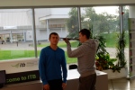
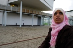
This week our task was to take no more than ten photos and tell a story with those pictures

In my group was:

  • Dean – Robber 1
  • Monika – Robber 2
  • Gary – Hostage
  • Obi – Photographer 1
  • Michelle – Photographer 2
  • Fatima – Bank Manager

Our story was a bank robbery. The story goes as follows:

  • Photo 1 – Robbers enter bank.
  • Photo 2 – Robber threatens a hostage.
  • Photo 3 – The hostage prays for his life.
  • Photo 4 – Robber takes money off the Bank Manager.
  • Photo 5 – Robber threatens Bank Manager.
  • Photo 6 – The hostage gets shot.
  • Photo 7 – The robbers escape.
  • Photo 8 – The Bank Manager is stunned.

Visual_Language_Week_4_Botanic Gardens

This week we went to the Botanic Gardens. Here we done 2 tasks. First, we began to draw pictures for Visual Language. This included drawing:

  • contour drawing
  • blind contour drawing
  • negative space
  • thumbnail drawing
  • pattern

Next we began taking pictures for Digital Photography. This included taking pictures with

  •  complementary colours 
  • large DOF
  • small DOF
  • pattern
  • texture

Visual Language-Week 3


Painting - Visual Language

Painting - Visual Language

This week we began in the lecture and looked at colour and the different types of colour e.g primary colours, secondary colours and tertiary colours.


We then moved over to the lab where we began using a stencil to create a series of designs onto a page. The design i chose was a skull. Our task was to break our page into four sections and colour each section in a different style.

The styles were:

1.Monochrome colours ( different shedas of one colour)

2. Complementary colours

Visual Language – Week 2

In week 2 we began by drawing dotted images and drawing different types of faces e.g angry face, face in love.

We then moved over to the lab and began drawing in different styles e.g contour drawing, drawing using implied lines, blind contour drawing (not looking at the paper when you are drawing) and drawing negative space.

Finally we took pictures of our drawings and posted them up onto our wordpress blogs.

Visual Language DHMED 1011 – Week 1

This week we were introduced to the visual language module. Our first assignment was to write about ourselves in 50 words or less and then draw 3 thumbnail pictures on what we had written. We then had to expand 1 of those pictures and draw a larger picture.

In our lab session we were introduced to wordpress. We then set up accounts and began designed and organising them. We then scanned our large pictures onto the Macs and posted them up on wordpress.